Opinions Wanted

Welcome to our Antique Bottle community

Be a part of something great, join today!

grizz44

Well-Known Member
Joined
Mar 17, 2012
Messages
135
Reaction score
0
Points
0
Location
K Falls, Oregon
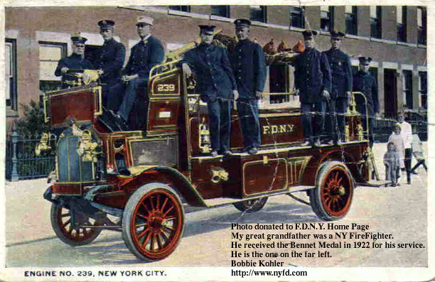
My latest hair brained idea is to use some old photos and postcards I have to blow up and and use for wall art. After spending hours editing and resizing this first one, I can't decide if I like the finished one which has a light brown tone (at least it looks light brown on my monitor), or the original gray scale image. Any opinions would be appreciated.

Original scan:


btest.jpg


Edited picture:


atest.jpg


Thanks
Chuck
 

surfaceone

Well-Known Member
Joined
Dec 9, 2008
Messages
11,161
Reaction score
24
Points
0
Hey Chuck,

I think the original looks better detailed. The sepia tint, which is also period, seems to soften it a skoch.

Either way, it's a helluva nice photo of the Engine Company. Thanks for showing it. How large are you gonna make it?

engine_239.jpg
 

grizz44

Well-Known Member
Joined
Mar 17, 2012
Messages
135
Reaction score
0
Points
0
Location
K Falls, Oregon
Thanks for the opinions. I'm leaning towards the bottom one but I stared at it so long while editing it started to look fake.


How large are you gonna make it?

Not sure how big. I don't have a lot of experience with big enlargements. Was thinking about 16 X 24 or 18 X 24. It depends on if they get grainy or blurry. I'll have to try a couple and see what they look like.

Thanks
 

epackage

Well-Known Member
Joined
May 3, 2009
Messages
19,057
Reaction score
425
Points
83
Location
Jersey
I think it all depends on the quality and size of the pic you started with, good luck... I'm gonna suggest Shorpy for great pics of the utmost quality and size. If you've never been there it'll blow your mind...
 

grizz44

Well-Known Member
Joined
Mar 17, 2012
Messages
135
Reaction score
0
Points
0
Location
K Falls, Oregon
I'm gonna suggest Shorpy for great pics of the utmost quality and size

Thanks Jim, thats a cool site. It looks like they stick with greyscale for their old pics.
 

epackage

Well-Known Member
Joined
May 3, 2009
Messages
19,057
Reaction score
425
Points
83
Location
Jersey
ORIGINAL: grizz44

I'm gonna suggest Shorpy for great pics of the utmost quality and size

Thanks Jim, thats a cool site. It looks like they stick with greyscale for their old pics.
They do but you can use a program like Infranview to turn them to the sepia tones if you wish, and the clarity and sizes are unmatched... I could spend days looking thru the stuff there...[;)]
 

Plumbata

Well-Known Member
Joined
Dec 4, 2007
Messages
2,732
Reaction score
47
Points
48
Location
Peoria Co.
B/W photo possesses more clarity, as Surf stated, but the sepia version screams "old" to the casual observer. If you plan to have more "normal" non-collector types see it, versus antiquarily-inclined purists, then the bottom image is my choice. It's not that I am against black/white, but B/W photos are still made by the millions presently. The sepia-toned version is more distinctively "antique" to even the most uneducated viewer. That's my opinion, anyway.
 

Members online

Latest threads

Forum statistics

Threads
83,433
Messages
744,355
Members
24,485
Latest member
Carpenter
Top