
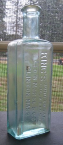
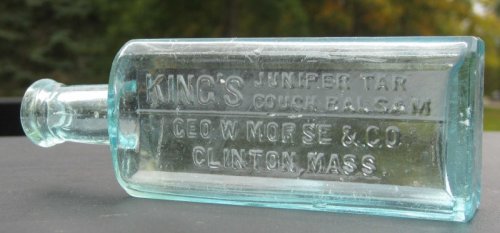
found this one over the weekend
- Thread starter Mike O
- Start date
Welcome to our Antique Bottle community
Be a part of something great, join today!

 ]
]
Similar threads
Members online
No members online now.
Latest threads
-

-
Researching Common finds: Historic Lamps, pottery, bricks etc...
- Started by Hladnopivo
- Replies: 0
-

-
 Is this a Miniature backbar bottle?
- Started by timeandabottle
- Replies: 2
-
 Hot day nothing like cooling off with a Mountain Dew and a snow maid
- Started by Bluestreak39
- Replies: 4
-
