SODAPOPBOB
Well-Known Member
- Joined
- Mar 10, 2010
- Messages
- 11,502
- Reaction score
- 49
- Points
- 0
[ ]
]
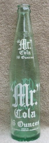
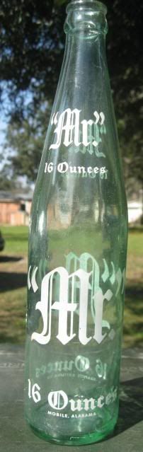
Here's your opportunity to show off what you consider to be the ugliest acl in your collection. I'm sure everybody has at least one. My least favorite of all is the "Mr. Cola" shown below ... I hate every thing about it! And here's why ...
1. It's a 16 ounce ... and a full eleven inches tall. I prefer 10 and 12 ounce bottles, with an occasional 6 or 7 ounce thrown in for good measure. But the Mr. Cola is so tall it looks like a giraffe standing next to a rabbit.
2. The lettering (I'm not sure what this particular font is called) is so large it literally borders on annoying. And for some reason they also embossed the name at the top to make it just that much more tormenting to the eye.
3. It was made in 1961 ... which for some reason also bothers me because I prefer bottles from the 1950s or earlier.
4. Plus I must not be the only one who dislikes it because it set on the shelf of an antique shelf for at least a year. The only reason I even purchased it is because the dealer saw me looking at it and said I could have it for $1.00 ... which is about 99-cents more than it's worth in my opinion.
So there you have it ... what is (in my opinion) the ugliest acl known to man! The only thing good about it is the fact it was made by "The Grapette Company - Camden, Arkansas." But unfortunately even that endorsement doesn't help it much.
So if you have an acl soda bottle you believe is uglier, please share it with the rest of us and we will have a vote at some point to determine the winner ... or should I say "Loser?" Lol []
Thanks ... and I hope this is not too "off-the-wall" to generate some interest.
SODAPOPBOB

]Here's your opportunity to show off what you consider to be the ugliest acl in your collection. I'm sure everybody has at least one. My least favorite of all is the "Mr. Cola" shown below ... I hate every thing about it! And here's why ...
1. It's a 16 ounce ... and a full eleven inches tall. I prefer 10 and 12 ounce bottles, with an occasional 6 or 7 ounce thrown in for good measure. But the Mr. Cola is so tall it looks like a giraffe standing next to a rabbit.
2. The lettering (I'm not sure what this particular font is called) is so large it literally borders on annoying. And for some reason they also embossed the name at the top to make it just that much more tormenting to the eye.
3. It was made in 1961 ... which for some reason also bothers me because I prefer bottles from the 1950s or earlier.
4. Plus I must not be the only one who dislikes it because it set on the shelf of an antique shelf for at least a year. The only reason I even purchased it is because the dealer saw me looking at it and said I could have it for $1.00 ... which is about 99-cents more than it's worth in my opinion.
So there you have it ... what is (in my opinion) the ugliest acl known to man! The only thing good about it is the fact it was made by "The Grapette Company - Camden, Arkansas." But unfortunately even that endorsement doesn't help it much.
So if you have an acl soda bottle you believe is uglier, please share it with the rest of us and we will have a vote at some point to determine the winner ... or should I say "Loser?" Lol [
]Thanks ... and I hope this is not too "off-the-wall" to generate some interest.
SODAPOPBOB